Friday, December 17, 2010
FINAL PROJECT: #TRiiBENATiiON:: Respect Thy TRiiBE!!! (FINAL VIDEO)
FINALLY VIDEO... ENJOY!
FINAL PROJECT: #TRiiBENATiiON Story Board
My story board for my commercial is basically zooming in and out of shots of my merchandise. The logo is the main focus of every shot as seen above in the stills.
Thursday, December 16, 2010
FINAL PROJECT: BASIC EDITS
WHEN I BEGAN TO EDIT THE FOOTAGE THAT I HAD, THERE WAS NO REAL THEME TO HOW I ORDERED THE SHOTS. I PLACED THEM PRETTY MUCH IN THE ORDER THAT I SHOT THEM..... I KNEW THAT I DIDNT WANT THE ORIGINAL AUDIO, BUT I COULDNT DECIDE EXACTLY WHAT SONG I WANTED TO PLAY IN THE BACKGROUND OF THE VIDEO. #TRIIBENATION STRUCK AGAIN!!!! I REMEMBERED OF OF MY FAVORITE HIP-HOP GROUPS FROM THE EARLY 90'S!!!! A TRIIBE CALLED QUEST.... NEXT I HAD TO FIGURE OUT EXACTLY WHICH TRACK OF THEIRS I WOULD USE!!!
FINAL PROJECT: ROUGH FOOTAGE
These are stills of some of my first couple shots i recorded for my commercial. I made sure that my logo was as visible as possible because that's the purpose of the commercial, for PROMOTIONAL PURPOSES!
Let's Make a Movie!
I'm not really making a movie, although that would be real cool. For my final project it took a while to come up with an actual focus or topic to shoot. At first I was really inspired by a photographer/ short film maker named CJ Something and wanted to make a video similar to his. I liked the black and white footage and the focus on certain things. But when it actually came down to it the video doesn't have any real content. THEN IT DAWNED ON ME.... TRIIBE NATIION!!!! LET'S MAKE A PROMOTIONAL VIDEO FOR SOME OF OUR FIRST ITEMS!!!! And thats what i planned to do and began to take the necessary steps to get the footage i need to make the commercial.
This is the vieo by CJ Something that inspired me at first.
Culture of Creativity Intro from CJ Something on Vimeo.
SPiiDER-MONKEY!!! (Composition Print)
This is the composition that I printed. It took a couple tries to get the coloring that i wanted correct but it worked out eventually..........
YOU DONT KNOW ME?! (Brief Bio)
Me?! Me! Me I'm Bola! Yes Bola Okoya, graduating senior criminology major at The College of New Jersey. Feel like i've been in school forever! I graduated the top of my class at Trenton Central High School not too far from here. Up until coming here to TCNJ I had no knowledge of some of the programs that i use now on a regular basis. Things like Photoshop, Illustrator, and Final Cut pro were all foreign to me.With my curiosity i ran wild using photoshop and can say the i am pretty decent being that i taught myself almost everything! it wasn't until this semster that i really got into using Illustrator and FInal Cut Pro, which both still give me headaches trying to figure out. I've always had an "artisitic" side to me, ranging from, drawing, to graffiti, all the way to fashion. So I would say that i get my inspiration from street art mostly, usually most of the art work that i produce has some sense of graffiti or street art to it. I love that art form. ITS SO RAW and HARDCORE. that i notice it everywhere.I that at transformed it into alot of what i do now, which mostly has to do which fashion and clothing. I owned my own custom design company "PRIMO DESIGNS" since my freshman year, and i still take orders and fulfill request from time to time. More recently my brother and I have formed what is known as "TRIIBE NATIION" a new fashion line that we see going very far and getting a lot of buzz in the tri-state and hopefully further out. I personally created the logo using Illustrator and Photoshop! I usually spend my time hanging out or doing one of the above things, Primo Designs, Triibe Nation and something related to clothing or fashion. Yep thats me... ME!!!
Friday, October 15, 2010
WEEK 6: MIDTERM PORTFOLIO
This is a group of compositions that I put together. Most of the pictures that I put together, I took them myself. These compositions reflect some of my creativity.
IMAGE #1: This first image was originally a photo I took of the Washington monument. I wanted to portray or reenactment of King Kong on the Empire State building but couldn’t find a monkey large enough via Google images, so I made due. First I made a selection of the monkey, which was surrounded by trees and hand from a branch in the original picture. I then moved the monkey to the picture of the Washington monument. After rotating the monkey to better fit the monument I selected and copied parts of the monkey (the right hand and lower part of the body) so that they were on top of the building, giving in the effect of hanging from the building. After that I began to use the healing tool on the monkey to make it a little more realistic. Lastly I changed the mode of the picture to grey scale and changed the levels to darken the picture; as well I used the burn tool to further darken the sky.
IMAGE #2: This next image is composition of several images resized and placed inside of text. It reads “DC CHILLIN” a line from a song by Wale featuring Lady Gaga. I used 8 different images that I took while in Washington sometime last month. The photos include some of the nations monuments, Howard University, and a duck. The images, because I took them, had to be resized to fit the text.
IMAGE #3: This image is basically a picture of me standing on the step of the Lincoln memorial reaching for the Washington memorial. I thought it would be a cool idea to replace the Washington memorial with the Eiffel Tower. First I used the healing tool to remove the Washington memorial from the background of the image. I then selected the Eiffel Tower from the Google image I found and dragged it to the photo of me. I then used the healing tool to fit the base of the tower better with the image of the nation mall at the end of the pool. I changed the contract and tone of the image.
IMAGE #4: This next image is a composition is a series of layers that I put together with a few color changes and a lot of use of the burn tool. First I scaled the image to fit the screen and since there was blank space at the top I painted it black. I then selected the person and made a layer via copy. I then cut out the heart attached to the wings and placed it behind the person, and used the burn tool to make it blend in better. I used a stock photo for the lightning. I selected it and dragged it to my composition and used the dodge tool to make it pop out and seem brighter.
IMAGE #5: For my next image I simply did a color change. I took this close-up photo of a bush myself. My goal was the to take the photo and make it seem more tropical like it was from a rainforest. I first changed the hue/ saturation to make the green a little brighter. I then played with the channel mixer and ended up changing a lot of the reds in the picture into blues and greens giving it that tropical feel I was looking for. I then changed the levels to dim out some of the bright spots in the picture.
IMAGE #6: This lat picture took me a lot of time. I got the idea to place Spider Man in a different environment. Both images are stock images. First I selected Spider Man from the original picture and turned him 180 degrees horizontally so he was now facing the right instead of the left. The next part was the toughest. Before I could move Spider Man to the other photo I had to remove one of the gargoyles from the building because I would replace it wit Spider Man. I used the healing tool several things before I could remove the gargoyles enough that when I change the color of the picture it wouldn’t be noticed. Next I moved Spider Man to the side of the building where the third gargoyle once was. Next I changed the color of the picture to a black and white image with a brown/ gold tint to it. After doing this I then changed the hue/ saturation to get the exact color I wanted. Next I use a filter tool to posterized the image. It came out that most of the postertization was done to the background of the image making Spider Man stand out which is what I wanted. Finally I inserted a sky to give it more of a rain effect.
SELF-EVALUATION: One thing that I find myself doing alot is making things seems to animated. There's nothing wrong with animation, its just that i personally need to think more openly about the different compositions that i choose to do. I feel that i work very well with photo-shop and that i still have a lot of things to learn, but as far as my vision, I feel i am very creativity in choosing things like color ans position and such. one thing that I really need work on is smoothing out edges to pictures that I composite with over pictures, an example being images 1, 4, and 6.
Thursday, September 30, 2010
Thursday, September 23, 2010
GREYSCALE xBURN TOOL
These are some pictures that i took for my Documentary Photography Class... I like em, hope you do too....
Assignment #3: Compostions
This is a picc i put together using pictures that i took in the nations capital... DC

This is a composition of Lupe Fiasco with Angel wing... i used the burn tool alot in this picture.

This is a picture of a student here at the college with a little inner glow and the background is the Sun.
Thursday, September 16, 2010
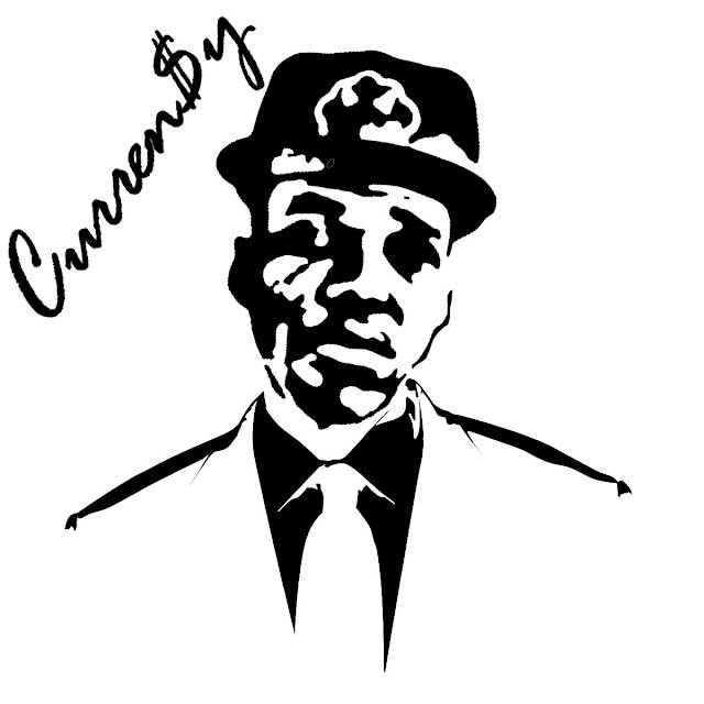
#JETS LOVE: CURREN$Y x QUEST LOVE via PhotoShop
USING THE MAGIC WAND (MY FAVE TOOL) & THE FILTER GALLERY I PUT CURREN$Y'S HEAD ON QUEST LOVES BODY IN A SUIT AND TIE AND FLIP FLOPPED THE BLACK WITH THE WHITE.... I BELIEVE I USED THE STAMP OPTION IN THE FILTER GALLERY.....
.....AND HERE ARE THE ORIGINAL PICTURES I USED......
I THINK THIS IS A PRETTY NEAT PICC....
KAWS x RIHANNA= #NIICCCEEEE!!!!
Second Assignment: Magic Wand tool & Using the filter gallery
This is a "KAWS" inspired piece.... i really like it......
This is a "KAWS" inspired piece.... i really like it......
here are the original images...
Assignment #1... Timed drawings
Labels:
Bape,
Mighty Helathy,
Monster,
Nike,
Triibe Nation
Subscribe to:
Comments (Atom)


